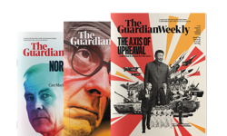
The tables at Syracuse University were adorned with jaw-dropping artwork. There were detailed infographics, beautiful photographs intricately cut out and merged with clever words and stylish typography kerned to perfection. There were pieces that could be framed and hung on any living room wall. But this was not an art exhibition … it was the judging room at the 35th Society for News Design's annual awards. The awards, held each February, showcase the best newsprint pages on the planet. This year, remarkably, The Guardian was among the top five. I say ‘remarkably’ because it is a rare accolade for Britain, where design is often seen to be less important. The last time a UK paper won the top award, The Guardian again, was seven years ago. At SND35 it was joined by Sweden’s Dagens Nyheter, Die Zeit and Welt am Sonntag from Germany and The Grid from Canada.
The awards offer an indication of trends and which countries are taking design seriously. It has, for example, been interesting to watch the emergence of the Middle East titles, particularly the Times of Oman under the guidance of Mario Garcia, and the Gulf News.
Newspaper design has fascinated me since I drew my first hot metal page in 1977. In the last 20 years, my colleague, Mike Brough, and I have redrawn or relaunched more than 90 newspapers and magazines. We have worked abroad - including the Gibraltar Chronicle and the International Herald Tribune - and for national papers. But most of the redesigns have been regional newspapers in Britain and Ireland where we have launched titles, taken broadsheets to compact, daily papers to weekly and produced live magazines and supplements.
Some have allowed us to flex our creative muscles but most have been a far cry from the double-page graphics that were on display in New York. The world’s finest may be inspirational but they are a million miles away from the templated layouts of the Couriers and Observers that serve the provincial towns of Britain. On the wide-open spreads of The Grid, you will rarely find an advert. At the local Observer, there will be stacked ads, with editorial gasping for space between the columns. At the Times of Oman, you will find a cast of thousands, including an art director, and nobody banging on about high story counts. At the weekly Post you will find one sub (if you still call them subs) with little graphic or typographical skill, under pressure to churn out pages while feeding the endless appetite of the website. So are these grand awards merely an indulgence - or can local newspapers take anything away from the globe’s most lavish layouts?
Unsurprisingly, I think they can. What newspapers now need more than anything is longevity. They need to convince advertisers and readers to stay with them while they get their digital houses in order. Eye-catching design really can keep the circulation stable and, equally, bad design can cause premature haemorrhaging. Nobody doubts that, yet how many times do we still see flights of dull fillers, plundered from the 'what’s on' column? How many times do we see good stories squeezed into pre-drawn shapes with meaningless headlines? How many times do we count the ‘boosts', ‘plans’ and ‘residents’ and question the drip, drip effect they have on the reader? How many times do we see pictures of buildings used as the main image? If longevity is the aim, these nasty habits need to be changed. Quickly.
I understand why editors have put design down the pecking order. If I were running a local newspaper, I would devote the newsroom’s energy to gathering content that people really want … not on processing. I would be happy to adapt templates - but with twists. The problem with templating is it makes journalists lazy and stifles their creative juices. They often default to the shape of the page, rather than making the template tell the story. Journalists need to keep talking and thinking about presentation.
A cracking tale can be made as dull as ditchwater by unbroken columns in 8pt Times Roman, an undersized square picture and a two-deck headline (the same shape as the one on the facing page) with no other entry points. This is just boring – and in modern newspapers being boring is the biggest sin.
There are three things that should never be far from an editor’s thoughts.
* Digital design has made content visual, effortless and sexy. By contrast, print pages can look static, grey and hard to follow. How can you narrow the gulf between what is offered digitally and in print?
* If nothing changes, everything remains the same … and that includes the sales figures. If you were 15 per cent down in the last ABC round and you haven’t done anything differently, guess what. You will be down by 15 per cent in the next set of figures too.
* The industry is moving faster than ever and with it people's expectations. If you look the same as you did two years ago, you probably look out of date.
With that in mind, I encourage editors to review the appearance of their titles at least once a year. To help, we ask them a raft of questions. They include:
1. Do you need to smarten up?
All redesigns start with one key question. What are you seeking to achieve? The answer used to be to bring in new readers, perhaps younger people or a different socio-economic group, or to expand geographically. Sometimes it was to fend off an aggressive competitor or launch a section with commercial potential. Nowadays, a redesign is often to stop existing readers from leaving … to try to stem the circulation decline. A redesign can help prolong the longevity of a title but not on its own. It needs to go hand in hand with a content review and strong marketing.
2. What is the difference between print and digital?
Are you serving the same market and offering the same content or is there a differential? What are the reasons people might buy the paper rather than visit the free and immediate website? Does the print version need longer-reads, analysis, columnists, FoI reports, picture essays and investigations? What are the devices to promote the paper from the website and tablet and vice versa. There has to be a clear purpose and commercial strategy for the digital and print services on offer - and these must be reflected in the design.
3. Does Page 1 do its job?
Good design is about selling - and nowhere is that more apparent than Page 1. Does your title piece do its job - or is it an outdated legacy from 30 years ago. Do serif italics really reflect your market aspirations? Does the blurb make people want to pick up the paper? Is the front page different every edition or does it become like wallpaper? Words sell newspapers - but only interesting ones - and the best headlines are invariably written first.
4. Just how legible?
I was at a newspaper recently where there had been complaints that it was hard to read - not surprising as the body copy was 8pt Times Roman with no leading. There are lots of modern and inexpensive fonts at your fingertips - don’t get hamstrung by history. You can be readable and modern.
5. What’s the structure?
Traditionally, newspapers put news at the front, then comment and letters, a toning down to features, and perhaps business and TV, with classified forming a bridge to sport. Why not challenge that? With digital media breaking the news - what exactly is the difference between news and features? Giving readers topics of genuine interest, making the pages lively and creating surprises can work much better.
6. Where's the white space?
Look at the designs from SND35. They certainly aren’t afraid of white space. These editors don’t think value for money means cramming every available inch with grey text and filler material. Let your pages breathe.
7. How good are your visuals?
The web has underlined how important pictures are. Magazines, even the serious ones, always lead on an image. One of the best digital developments has been the resurgence of graphics. The Daily Mirror’s excellent Ampp3d data site – aspiring to make journalism more accessible through infographics - has been a revelation. The Washington Post's graphic showing the possible depth of MH370's resting place was first rate. But most regional newspapers have jettisoned infographics. A staff artist may be unaffordable but there are other ways. Why not use the local art college - set the students projects and give bylines and prizes? Too many papers have also failed to harness the fact that everyone carries a camera. Yes, they have brought in the citizen photographers and pages are littered with beautiful landscapes. I am not impressed. Newspapers are about people, not mountains and trees. If you want flowers, buy a bulb catalogue. Good pictures transform a page more than anything else … selection, cropping and one bull image per page is still the key.
There are many more questions … but the main point is that design in print remains crucial. That doesn’t mean regional papers need to employ banks of artists and designers. But it does mean editors need an understanding of layout and design so that templating leads to good visual story telling … not just filling boxes. Returning to SND35, this is what the judges said they were looking for in the winners:
• A timeless design
• A strong voice
• A bold approach
• An apparent hierarchy
• A design that serves the readers
• Visuals that excite
• Good ideas
• Consistency
• Courage
It is an excellent list – and one that all local newspapers should embrace. It might just prove to be the recipe for a longer life…